Penquin Unveils New Logo And Corporate Identity
Penquin Unveils New Logo And Corporate Identity. Penquin, the popular brand and communication agency based in Johannesburg, proudly unveils its dynamic new logo and refreshed corporate identity (CI) today, marking a significant milestone in its journey of continuous evolution and innovation.
This rebranding initiative reflects the agency’s commitment to delivering creative and strategic solutions that keep their clients competitive and relevant in the rapidly changing marketing landscape. As a beacon of creativity and strategic insight, Penquin has long been recognised for its ability to craft compelling brand stories, ignite conversations, and generate impactful ideas across a multitude of media channels. Their approach is deeply rooted in thorough research, strategic planning, and a profound understanding of their clients’ business goals, ensuring outcomes that not only resonate with target audiences but also drive tangible results.
The decision to undergo a rebrand reflects Penquin’s ambition to embody a more spirited, meaningful, and agile identity. “Our rebrand represents more than a visual transformation; it signifies our dedication to inspiring awesome, together, pushing our brand’s presence further into the world with renewed vigour and purpose,” says Ryan Nofal, Managing Director of Penquin. “This rebrand aligns seamlessly with our strategic direction, core values, and the essence of our brand manifesto. It’s a declaration of our commitment to not just keeping pace with the industry but setting the standards for creativity, innovation, and excellence.”
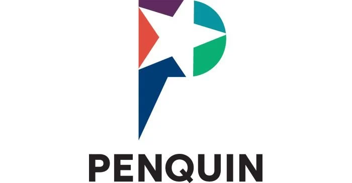
The new logo draws inspiration from the stars, symbols of hope, guidance, and endless exploration possibilities. Sirius, the brightest star visible from both the evening and morning skies over Johannesburg, serves as the focal point of this inspiration. “The star motif in our new logo, with its five points reflecting our core brand values of being bold, creative, purposeful, accountable, and innovative, signifies our guiding light in the vast advertising universe,” Nofal elaborates. “The open design elements and the strategic tilt correlating with Sirius’s declination are nods to our openness to fresh ideas and our rootedness in Johannesburg, our home base from which we aim high and dream big.”
With this rebrand, Penquin is set to continue its legacy as the creators of brand stories and the architects of conversations that matter. The agency’s revamped identity is not just a change in visuals but a renewed commitment to pushing boundaries, driving innovation, and delivering solutions that inspire and captivate.