KWÊ: How African Wildlife Art Shaped a South African Clothing Brand
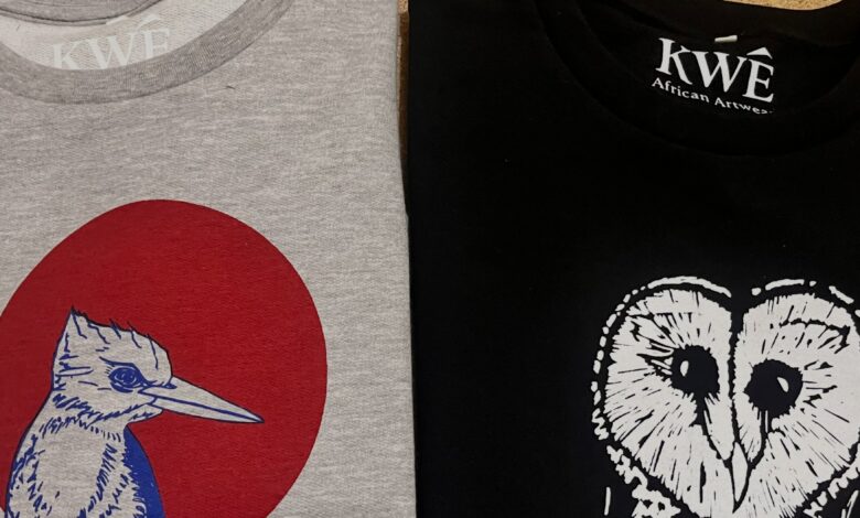
KWÊ: How African Wildlife Art Shaped a South African Clothing Brand. A clothing brand does not always need a complicated logo or a bold slogan to make a statement. Sometimes, the artwork itself is enough. This is the thinking behind KWÊ, a bespoke South African clothing brand built around hand-drawn illustrations of African landscapes, wildlife, birdlife and flora.
The name KWÊ comes from the unmistakable call of the Grey go-away bird, giving the brand a distinctly African point of reference. Its clothing combines detailed illustrations with deliberately minimalist branding, allowing the artwork to take centre stage.
The designs are intended to evoke nostalgia for a pre-digital era, connecting wearers with what the brand describes as the raw spirit of Africa. Rather than relying heavily on written messages or prominent branding, KWÊ uses visual storytelling to communicate its identity.
For aspiring entrepreneurs, this offers an important lesson in product positioning: a brand’s identity does not have to compete with its product. When the product has a strong visual character, the branding can support it without overwhelming it.
The Greyloerie Art T-shirts Journey: Starting at Local Markets
One of the most important parts of KWÊ’s development happened before the rebrand. For several years, its designs were sold at local markets under the name Greyloerie Art T-shirts.
This ground-up approach gave the business direct experience with customers and allowed its designs to be tested in a real selling environment. The brand describes its designs as tried and tested, noting that they have become popular at local markets.
This is a significant foundation for the next stage of the business. Rather than introducing an entirely untested clothing concept, KWÊ is taking experience gained through direct customer interaction into a new brand identity.
There is a practical lesson here for entrepreneurs who want to launch a product business but have limited resources. Starting small can provide an opportunity to learn how customers respond to products before committing to a larger commercial operation.
Local markets can also offer something that online research cannot fully replicate: direct conversations with buyers. Entrepreneurs can observe which designs attract attention, listen to customer feedback and better understand how people respond to their products.
KWÊ’s experience demonstrates the value of using those early interactions as a foundation for future decisions.
Why the Rebrand to KWÊ Matters
The move from Greyloerie Art T-shirts to KWÊ represents a new chapter for the business. The name draws from the Grey go-away bird, while the phrase “from the heart of Africa” reinforces the brand’s connection to the continent.
This change is more than a different name. It gives the business a concise identity that reflects the inspiration behind its products.
The transition also creates an opportunity to bring the brand’s visual direction, product philosophy and local manufacturing commitments together under one recognisable name.
For entrepreneurs, rebranding should have a clear purpose. Changing a name or logo is not automatically a growth strategy. It becomes more meaningful when the new identity communicates what the business stands for and provides a stronger foundation for how it wants to present itself to customers.
KWÊ’s stated intention is to take the experience gained through its market trading to the next level. Its rebrand therefore builds on an existing customer-facing business rather than marking the beginning of an entirely new venture.
Letting the Artwork Do the Marketing
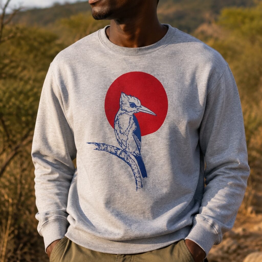
One of KWÊ’s defining decisions is its preference for hand-drawn designs with little to no writing. The brand also deliberately keeps its branding minimal so that the illustrations can have their full effect.
This approach gives the artwork a central role in communicating the product’s identity. African landscapes, wildlife, birdlife and plants become the main visual features, helping distinguish the clothing from designs that depend on large slogans or prominent logos.
The pre-digital nostalgia behind the illustrations adds another dimension. It gives the brand a particular creative direction rather than presenting its designs as generic African-themed clothing.
For business owners, the lesson is to identify the strongest feature of a product and build the presentation around it. Marketing does not always require adding more messages. Sometimes removing visual distractions allows the most distinctive part of a product to communicate more effectively.
Consistency is also important. When the design philosophy is recognisable across a collection, customers can begin to associate that visual language with the brand.
Local Manufacturing as Part of the Brand’s Value
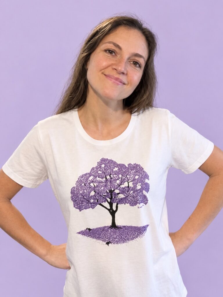
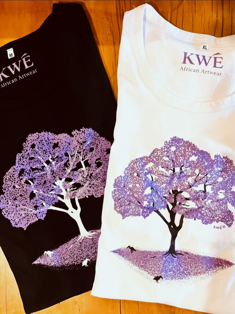
KWÊ’s product decisions extend beyond the illustrations. Its T-shirts are locally manufactured using 100% combed cotton, selected for its soft feel. The designs are applied through traditional screen-printing with water-based inks, which the brand describes as durable and eco-friendly.
These choices connect the clothing to the brand’s wider commitment to local production and artisanal skills.
KWÊ supports the protection of traditional skills and local manufacturing, highlighting concerns about mass production and imports threatening local livelihoods. Its position is that supporting local manufacture can contribute to the growth of the local economy while helping preserve skills that are becoming increasingly rare.
This gives customers another reason to understand what distinguishes the brand. The value proposition is not limited to the appearance of the illustrations. It also includes the materials, printing method and manufacturing approach.
For entrepreneurs, this demonstrates how operational decisions can strengthen brand positioning. If local production is part of a business’s identity, it should be reflected in the actual sourcing and manufacturing process, not simply used as a promotional message.
Building a Business Around a Clear Point of Difference
KWÊ brings together several elements: African-inspired hand-drawn artwork, minimalist branding, locally manufactured cotton T-shirts and traditional screen-printing using water-based inks.
Each decision supports a consistent identity. The illustrations establish the creative direction, while the manufacturing choices reinforce the brand’s commitment to local craftsmanship.
The business’s experience under Greyloerie Art T-shirts also shows the importance of learning directly from customers before moving into a new stage of development.
For aspiring entrepreneurs, there are several practical lessons to take from this journey. Start by developing a product with a recognisable point of difference. Test it in an environment where customers can respond directly. Use those interactions to build experience, and make sure any rebrand communicates a genuine evolution in the business.
It is equally important to ensure that the brand’s values are visible in the product itself. KWÊ’s emphasis on local manufacturing, traditional screen-printing and hand-drawn designs gives its positioning a tangible foundation.
Taking the Next Step From Market Trading to Brand Building
KWÊ’s transition is rooted in experience already gained through years of trading at local markets. The rebrand provides an opportunity to present those established designs under an identity that more directly expresses their African inspiration.
The available information does not detail specific retail expansion, online sales performance or new distribution partnerships. Its next stage is therefore best understood through the brand’s stated ambition to build on its direct-to-customer experience.
What makes the journey relevant to entrepreneurs is the way the business has connected product design, customer experience and manufacturing choices. KWÊ is not relying on a name alone to establish its identity. Its illustrations, materials and production methods all contribute to the story it wants its clothing to tell.
Ultimately, KWÊ demonstrates how a distinctive creative idea can provide the foundation for a clothing brand. By drawing inspiration from Africa, valuing local craftsmanship and using customer experience gained through market trading, it is taking an established product offering into a new chapter under a more focused identity.